Seasonal Color Analysis
Answer a few quick questions about your natural coloring. You'll get your season out of 12, how close your runner-up is, your best neutrals, a 12-color palette with hex codes, and a printable card.
Everything runs in your browser. Nothing you choose or upload is sent anywhere.
Drape mirror: try colors on your own photo
Add a selfie taken in daylight, facing a window, with no heavy makeup. Your photo stays in this browser tab and is never uploaded or saved. Tap a portrait to select it, then tap a color to drape it.
Look at your skin, not the color: shadows under the eyes, redness, and how even your skin looks. Phone screens shift color a little, so trust big differences, not tiny ones.
If you have ever stood in front of a mirror and thought, why does this pink make me look tired, this is for you. The seasonal color analysis tool above reads your natural hair, eye, and skin cues, then gives you one of 12 seasons, your closest runner-up, your best neutrals, and a printable palette you can take shopping. I worked out why my cream knits washed me out the slow way, holding sweaters up to my face at a window. The tool gets you to the same answer in a couple of minutes.
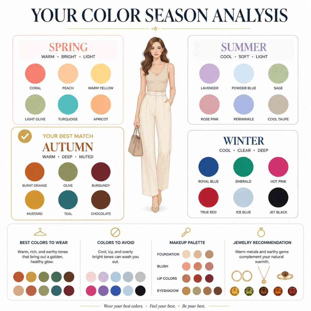
How to Use the Seasonal Color Analysis Tool
- Sit facing a window in daylight, with no heavy makeup or tinted moisturizer.
- Tap your natural hair color, not dyed. Gray and silver have their own option.
- Pick your eye color.
- Choose your skin depth and undertone. Not sure about undertone? Pick Not sure, help me for a quick drape question, or do the test below first.
- Set your contrast level. The black-and-white selfie below settles it in a minute. If you skip it, the tool estimates contrast from your hair and skin.
- Answer the optional bright or soft question. It’s the best tiebreaker between neighboring seasons, like Clear Winter and Soft Summer.
- Click Find my season.
You’ll see your season, how close the next two seasons are, your best neutrals, and a 12-color palette with color names and hex codes.
Two Quick Checks Before You Answer
Contrast: Take a Black-and-White Selfie
Face a window, leave your hair down so it frames your face, and take a selfie with your phone’s mono filter (or turn a regular photo black and white in your editing app). With the color gone, light and dark are much easier to judge. Treat it as a quick estimate, though: window light, exposure, and your phone’s processing all nudge the result, so take two shots a few minutes apart and go with what they agree on.
- Low contrast: your hair, brows, eyes, and skin blend into similar grays.
- Medium contrast: some separation, but no feature jumps out.
- High contrast: a sharp jump from very light to very dark, like near-black hair and brows against fair skin.
Contrast is the gap between your features. Depth is how light or dark you are overall. Answer them separately in the tool.
Undertone: The White vs. Cream Drape
Pull your hair back and hold a bright white tee or towel under your chin, then swap it for an ivory or cream one. Watch your skin, not the fabric.
- Pure white makes you look fresh and cream makes you look sallow: lean Cool.
- Cream makes you look healthy and white looks harsh or grayish: lean Warm.
- Both look about the same: you’re probably Neutral.
Treat this as one clue, not a verdict. Bright white also tests how much clarity your face can carry, which is why some cool Summers find optic white too stark. If the answer isn’t obvious, compare another warm and cool pair, like coral against raspberry, or try both on your own photo in the tool’s drape mirror.
The gold vs. silver test works the same way. Hold a gold necklace and then a silver one against your collarbone. The metal that makes your skin look clearer, instead of pulling out redness or shadows, points to your side. It’s supporting evidence only: polish, finish, and lighting change how metal reads, so if both look fine, let the fabric test decide.
If you feel neither warm nor cool, you may have olive skin. Olive has a green or slightly gray cast that confuses both tests: yellow can look sallow on you, and icy pastels can make you look gray. Choose Olive in the tool instead of forcing Warm or Cool. Olive skin shows up in every season, from soft to bright, so it doesn’t decide your result on its own. Your contrast and the bright-or-soft question do more of the work. Still stuck? The Undertone Finder Quiz walks you through a few more checks.
How Seasonal Color Analysis Works
Every season is a mix of three color dimensions, plus how much contrast your features have.
- Undertone (temperature): whether your coloring leans warm (golden, peachy) or cool (pink, blue-red). Spring and Autumn are warm. Summer and Winter are cool.
- Depth (value): how light or dark your overall coloring is. Light Spring and Light Summer sit at one end, Deep Autumn and Deep Winter at the other.
- Chroma (clarity): how clear or muted a color is. Clear colors look pure and saturated, like lemon yellow or true red. Muted colors have a little gray mixed in, like sage or dusty rose. Springs and Winters usually wear clearer colors; Summers and Autumns usually wear softer ones.
The classic four seasons sort you mainly by undertone. The 12-season version splits each season into three, based on which dimension is strongest in your coloring. That’s why Clear Winter and Soft Summer can both be cool and still need completely different wardrobes. A Clear Winter’s high-contrast features can handle crisp, saturated color. A Soft Summer looks best in gentle, grayed shades that don’t overpower her. Your results show where you land on all three scales, next to the center of your season.
You’ll see different names for the same seasons around the web. Clear seasons are often called Bright, and the middle season of each group is often called True. The tool uses Cool Winter, Cool Summer, Warm Spring, and Warm Autumn for those True seasons.
The 12 Color Seasons at a Glance
| Season | What leads | Neutrals in the tool | Colors to try |
|---|---|---|---|
| Light Spring | Light and warm | Ivory Sand Light camel Warm light gray | Light peach Light coral Light aqua Spring green |
| Warm Spring (True) | Warmth, with clarity | Cream Camel Golden brown Warm navy | Peach Golden yellow Warm turquoise Grass green |
| Clear Spring (Bright) | Clarity and high contrast, warm | Bright ivory Camel Warm charcoal Clear navy | Coral Poppy red Clear aqua Kelly green |
| Light Summer | Light and cool | Soft white Rose beige Soft gray Gray navy | Rose pink Sky blue Mint Lavender |
| Cool Summer (True) | Coolness, with softness | Soft white Cool gray Blue gray Gray navy | Rose Raspberry Powder blue Soft teal |
| Soft Summer | Muted and cool | Soft white Rose beige Mushroom Cocoa | Dusty rose Dusty blue Sage Smoky plum |
| Soft Autumn | Muted and warm | Oyster Warm beige Mushroom Coffee | Salmon Terracotta Sage green Soft teal |
| Warm Autumn (True) | Warmth, rich and earthy | Cream Camel Golden brown Olive brown | Pumpkin Rust Mustard Warm teal |
| Deep Autumn | Depth, warm | Cream Camel Chocolate Espresso | Deep red Rust Forest green Petrol blue |
| Cool Winter (True) | Coolness, crisp | Pure white Black Charcoal Navy | Blue red Icy pink Royal blue Pine green |
| Clear Winter (Bright) | Clarity and high contrast, cool | Pure white True black Charcoal Navy | True red Hot pink Royal blue Emerald |
| Deep Winter | Depth, cool | Pure white True black Charcoal Deep navy | Deep red Magenta Royal blue Emerald |
If your result surprises you, compare the seasons that share its leading trait: the two Light seasons, the two Soft seasons, the two Deep seasons, the two Clear seasons, or the True seasons on the same side of warm and cool (Warm Spring and Warm Autumn, Cool Summer and Cool Winter). The tool also shows your two closest runners-up, and you can open any season’s full palette from the Browse all 12 seasons menu under the tool.
What Your Results Show
- Your season with a plain-English description of what leads in your coloring.
- Three scales showing where you sit on undertone, depth, and chroma.
- Your runner-up seasons with a match strength for each, plus a note when two seasons are too close to call.
- Best neutrals for jackets, denim, tees, and bags, including which white to wear.
- A 12-color palette with names and hex codes. Tap a swatch to copy its code.
- Lipstick directions, metals, and colors to keep away from your face.
- Copy color analysis to grab the text for notes, or copy a link that reopens your palette.
Try Colors on Your Own Photo
The drape mirror under the questions puts a color under your chin on your own selfie, two portraits side by side. Try white vs. cream, silver vs. gold, bright vs. soft, or your season against its runner-up, and flip on black and white to check your contrast. The photo stays in your browser and is never uploaded. It’s still a phone screen, so trust big differences, like shadows under your eyes disappearing, and don’t overthink small ones.
The shopping check in your results answers the question I ask most in stores: does this one work? Paste a hex code or pick a color, and the tool finds the closest shade in your season and tells you whether to wear it near your face or below the waist.
Print Your Color Palette, Then Use It to Shop
Hit Print palette card for a one-page card with your neutrals and all 12 palette colors, each with its name and hex code. Keep it in your bag for in-store trips, or save a screenshot for quick checks while you browse online. The hex codes help when you are hunting for the right “ivory” or “cool taupe” on a retailer page.
One honest warning: phone screens, laptops, and home printers all show color a little differently, and retailer photos add their own shift. Your printout may come out darker or duller than what you saw on screen. Use the swatches and hex codes to judge direction (warm or cool, crisp or muted), not as an exact paint-chip match, and check the real fabric in daylight when you can.
A Real Example: My Own Result
I tested it in soft morning light. My hair reads medium brown with cool ash, my eyes are dark blue, my skin is light with a cool undertone, and my contrast is high. The tool put me in Clear Winter, with Cool Winter a very close second. The neutrals showed pure white, black, charcoal, and navy, which explains why my cream knits never look quite right. Printing the palette made shopping simple. I found a true-red sweater online in five minutes.
You Don’t Have to Toss Half Your Closet
Knowing your season pays off slowly. As your tops and jackets start to share the same temperature and clarity, they mix and match on their own, which means faster outfits and fewer returns. That doesn’t mean everything outside your palette has to go.
- Keep off-palette colors below the waist. Pants, skirts, shoes, and bags sit far enough from your face that they don’t change how your skin looks.
- Buffer them near your face. A scarf, a collar, or a lipstick from your actual season between your face and the color does most of the work.
If you are doing a closet reset, the Closet Audit Tracker helps you decide what to keep, tailor, or sell.
Quick Wins to Try Today
- Match your white to your season. Pure optic white looks sharp on Clear and Cool Winters. Light and Soft Summers usually look better in soft white, dove gray, or cool taupe, because stark white can overpower gentler coloring.
- If you are warm, try camel or warm beige for coats.
- Choose lipstick from your palette. One shade that loves you will beat five that do not.
- Use your new neutrals to build a mini capsule. Then test a color pop from the palette.
Related Tools to Pair With Your Palette
- Match your base makeup to your undertone with the Foundation Shade Estimator.
- Plan outfits for events with the Event Outfit Generator.
- Balance lengths and lines with the Body Proportions Mapper.
Seasonal Color Analysis FAQ
How accurate is the tool?
It’s a solid starting point, not a substitute for in-person draping with a trained color analyst. The tool works from a handful of answers, so good daylight and honest inputs matter most. If you are between two seasons, try colors from both and keep the ones that make you look fresher in daylight.
What if my hair is dyed?
Select your natural hair color if you know it. If not, pick the closest match and use undertone and contrast to guide the result.
Can my season change?
Your undertone stays stable, but contrast and depth can shift with hair changes or tanning. Recheck after a major hair color change.
Do I have to follow the palette perfectly?
No. Use it as a guide. If you love a color outside your season, try it away from your face or in a print mixed with your best shades.
What are the best first buys?
Start with neutrals you wear often, like a coat, denim, tees, a work bag, and one power lipstick that fits your palette.
Ready to see it for yourself? Scroll back up, answer the questions, and click Find my season. Then print your palette and take it shopping.