A diamond inside a diamond logo is a neat pair of nested rhombuses that signals clarity, structure, and quiet luxury. I like it because it scales from a shiny foil hangtag to a tiny favicon without drama, and it frames a monogram or icon beautifully.
Meaning and Symbolism
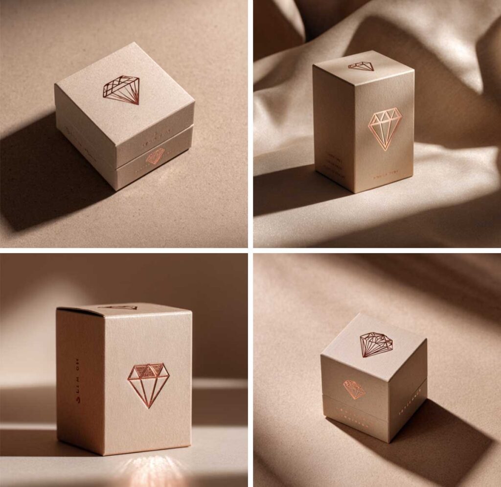
This mark reads premium on sight, especially on packaging and tags.
- Clarity. Two aligned shapes feel focused and refined.
- Strength. Sharp angles suggest resolve and durability.
- Heritage. It echoes old badges and guild marks, so it carries a craft story.
- Luxury. Even in simple line art, the silhouette whispers value.
- Balance. Symmetry steadies busy layouts, great for labels and lids.
- On pack. The double outline adds depth with low ink coverage, and foil loves straight edges that catch light.
If you design pendants, this Necklace Length Guide helps your logo and chain sit in harmony on chest shots.
A quick real life note
I tested a thin double diamond at a small print shop. The first gold foil plate chewed the hairlines, the second pass with slightly thicker strokes and a wider gap looked crisp and rich. Lesson logged, screens forgive hairlines, plates and paper do not.
Where This Mark Works Best
- Fashion labels. Neck labels, hem flags, size tabs.
- Jewelry lines. Earring cards, polish cloths, box lids.
- Bridal boutiques. Appointment cards, ribbon seals, tissue stickers.
- Skincare. Cartons, caps, subtle emboss panels.
- Streetwear. Chest hits, back neck prints, patches.
- Boutique retail. Gift cards, loyalty stamps, shelf talkers.
- Digital. Favicons, app icons, avatars, watermarks.
Diamond Inside a Diamond Logo, Design Styles to Try
- Minimal line art. Two even strokes, no facets, timeless.
- Faceted geometric. Split planes for sparkle without gradients.
- Vintage badge. Add a thin keyline and a tiny year mark.
- Monogram inside. One or two letters centered in the inner diamond.
- Negative space. Fill the outer shape, cut the inner out for foil, emboss, or stitch.
Grid and Proportions
Start with a square, rotate it 45 degrees, then center the twins so they share the same heart.
- Inner ratio. I start at 66 percent of the outer tip to tip. Safe range, 60 to 70 percent.
- Stroke weights. For print at 24 mm outer, about 0.94 in, try 1.0 mm outer and 0.8 mm inner. For screens at 48 px outer, 2 px outer and 1.5 px inner work well.
- Angles. Keep corners crisp at 45 degrees. Round them only if you want a softer skincare vibe.
- Spacing. Aim for a gap at least one inner stroke wide.
- Small sizes. Under 12 px, swap to a filled outer with a cutout inner, or drop to a single diamond.
Starter Spec, Copy and Paste
- Outer size. 24 mm print, about 0.94 in. 48 px screen.
- Inner size. 66 percent of outer.
- Strokes. Print 1.0 mm outer, 0.8 mm inner. Screen 2 px outer, 1.5 px inner.
- Gap. At least 1× inner stroke.
- Minimums. Print 16 mm, about 0.63 in. Screen 16 px favicon, use filled outer with cutout inner.
- Safe area. Clear space equal to half the inner stroke around the mark.
Color and Finishes
- Black and white. Highest contrast, easy to control.
- Soft neutrals. Warm gray and oat flatter bridal and skincare, keep contrast strong.
- Metallic foils. Gold, rose, silver all behave nicely on straight edges. Ask for a fine line plate and run a sample on uncoated stock so you feel the paper tooth.
- Embroidery. Bump thread weight up one step from what the vector suggests, and widen the gap so a satin stitch does not swallow it.
- Contrast tips. On web, aim for 4.5 to 1. In print, proof both coated and uncoated, thin lines gain ink.
Typography Pairing and Lockups
- Serif. Elegant and established, ideal for bridal and fine jewelry.
- Modern sans. Clean and current, strong for streetwear and boutique retail.
- Script. Use lightly, let the diamond stay strict while the script does the charm.
- Placement. Stack the wordmark under the emblem or park it to the right with one diamond width of space.
- Alignment rule. If stacked, match the wordmark width to the outer diamond width, align optically to cap height, then fix classic pairs like AV and To.
Files and Handoff
Save the master as vector, SVG, EPS, or AI. That is the file you guard like jewelry.
- Web exports. Keep an SVG for scaling, then export PNG at 512, 256, 128, and 32 px for quick drops.
- Color models. Lock one spot color and a CMYK build, then add RGB and HEX.
- One page brand sheet. Show the mark, spacing, color values, minimum sizes, and simple do not rules.
- Tiny helper apps. In Illustrator, Pathfinder Unite and Offset Path keep edges clean. If you are exporting SVG, a pass through SVGOMG keeps code lean.
Style Matrix
| Style | Line weight | Inner diamond ratio | Best use | Pitfall to avoid |
|---|---|---|---|---|
| Minimal line art | 1.0 pt print, 2 px screen | 0.66 | Fashion basics, skincare | Hairline foil breaks |
| Faceted geometric | 1.0 to 1.5 pt | 0.60 | Jewelry, beauty cartons | Busy facets at 24 px |
| Vintage badge | 1.2 pt plus keyline | 0.70 | Denim, heritage | Crowded year text |
| Monogram inside | 0.8 to 1.0 pt | 0.65 | Bridal, boutique retail | Monogram too tight |
| Negative space | Fill outer, cut inner | 0.62 | Foil, emboss, favicon | Low background contrast |
Production Checklist
- Proof on coated and uncoated.
- Embroider, widen the gap by about 20 percent, test a satin stitch on twill.
- Keep safe margins, half the inner stroke width around the mark.
- Foil, use a fine line plate, avoid strokes under 0.3 mm, run a test strip.
- Emboss or deboss, favor filled shapes or thicker strokes for depth.
- Screen checks, test at 16 px and 32 px, confirm a 4.5 to 1 contrast ratio.
- Color builds, list spot, CMYK, RGB, and HEX on the sheet.
- Handoff, package SVG, EPS, AI, plus PNG at 512, 256, 128, 32 px.
- Handy math, 1 in equals 25.4 mm if your vendor talks inches.
Keep sample pieces camera ready with Jewelry Cleaning and Care Tips so foil edges and stones look crisp in photos.
Use Cases with Mock Ideas
- Hangtags. Black outer stroke, foil inner stroke, wordmark centered below.
- Care cards. Tiny emblem in a corner so it does not fight instructions.
- Favicon. Filled outer diamond with a cutout inner, holds at 16 px.
- Social avatar. Outer diamond at 80 to 90 percent of the circle canvas, plenty of air.
- Box seal sticker. Circle sticker with the diamond reversed out for quick luxe.
- Garment labels. One color woven. If thread density is low, drop to a single diamond.
A quick “what fails” example
Hairline foil strokes under 0.3 mm on textured stock like cotton paper tend to break. If your printer flags it, they are saving your run, not nitpicking.
DIY Route vs Hiring
DIY in a free vector app.
I open Figma or Inkscape, draw a square, rotate 45 degrees, duplicate and scale to 66 percent, set strokes, then export SVG and PNG. In Illustrator, I unite paths and run Offset Path for tidy edges. I run the SVG through an optimizer, drop the icon into a browser tab to see the favicon at 16 px, then print it at 100 percent and 50 percent on matte card so I can feel the paper.
Hiring a designer.
Share your audience, vibe words, use cases, minimum sizes, color direction, monogram letters, and deliverables.
Ballparks. A simple mark with a mini sheet often comes in around 200 to 800 USD. A fuller identity with type and color tends to land between 1,500 and 5,000 USD.
Deliverables by tier.
- Logo only, vector masters in mono and one color, basic sizing notes.
- Mini identity, logo and wordmark lockups, color palette, type pairing, a one page brand sheet.
Rights and revisions. Ask for full commercial rights, vector masters, and at least two revision rounds so you can refine spacing and lockups.
If rings are part of your line, align packaging copy with the Ring Size Chart so sizing and branding stay consistent.
Trademark and Originality Notes
Quick sanity check, not legal advice. Make it yours with one small twist you can point to, for example a fixed inner gap ratio like 0.17 times the outer width, a single custom corner cut, or a rotated monogram that gently interrupts the inner outline. Do a fast search on USPTO and skim competitors in your product class. Steer clear of near matches in your niche.
First Hand Mini Test
I built a minimal version at a 66 percent inner ratio. The 16 px favicon read better with a filled outer diamond and a clean inner cutout. I printed a 24 mm hangtag, about 0.94 in, and stitched a cap patch. The satin stitch ate a narrow gap, so I widened spacing by roughly 20 percent. Embroidery wants breathing room, tiny icons prefer bold shapes.
FAQs
What does a diamond inside a diamond logo mean?
Clarity, strength, balance, and a quiet luxury signal.
How do I design a diamond inside a diamond logo quickly?
Open a vector app, center two diamonds, set the inner around 66 percent, pick clear strokes, export SVG and PNG, then test tiny.
What file type is best for handoff?
Vector masters, SVG, EPS, or AI, plus PNG sizes for fast use.
Can I trademark a diamond logo?
Often yes if it is distinctive. Add a clear twist and check your class before filing.
Minimal or faceted, which fits fashion best?
Minimal wins for basics and small prints. Faceted shines on jewelry and beauty cartons.
How do I keep it readable at small sizes?
Boost contrast, widen the gap, and use a filled outer shape with a cutout inner for favicons.
Where should the wordmark go?
Stack it under the emblem or set it to the right with one diamond width of space.
What ratio should I start with?
Sixty to seventy percent is safe. I start at 66 percent, then adjust by eye.
Downloadables Note
I can share a Double Diamond Grid PDF and a Favicon Test Pack, SVG and PNG at common sizes, so you can try the mark on your site header, hangtag, and browser tab in minutes.
- About the Author
- Latest Posts

I’m Iskra Banović, editor of Blufashion and the voice behind its fashion, beauty, and lifestyle stories. Fashion, beauty, and lifestyle are my playground, but I’m just as likely to share the messy side of it all, like the time I tested a “must-have” skincare gadget and ended up with glitter stuck in my hair. I love turning trends and everyday finds into something useful (and fun) for real people.


